Did you know 35% of the population are renters? That means 114 million people in the United States alone.
Bounce is an app for people looking for housing to rent with a universal rental application to apply to many rental homes in a short amount of time.
Bounce is an app for people looking for housing to rent with a universal rental application to apply to many rental homes in a short amount of time.
Project Type: Application
Project Duration: 4 weeks
Project Duration: 4 weeks
UI Design Team: William Tan (me), Monica Gerges
UX Research Team: Brett White, Sean Rose, Christina Scardino
Front End Programmer: David Gilson
UX Research Team: Brett White, Sean Rose, Christina Scardino
Front End Programmer: David Gilson
Key Contributions
-Iterated user flow and user
-Iterated the onboarding user flow based on usability feedback from research team
-Designed informative "about this app" flow
-Designed high-fidelity prototype
-Assisted research team with user flow and user scenario
-Iterated user flow and user
-Iterated the onboarding user flow based on usability feedback from research team
-Designed informative "about this app" flow
-Designed high-fidelity prototype
-Assisted research team with user flow and user scenario
Background and Research Phase
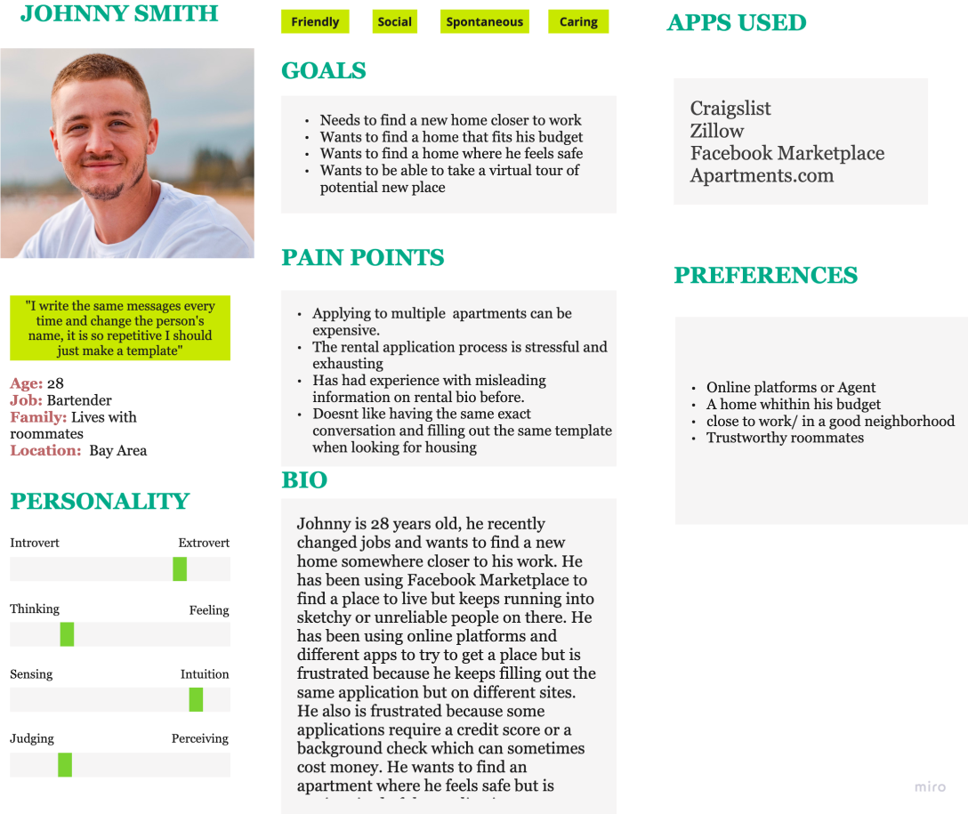
Through the research team's interviews, we learned that renters want a streamlined application process that they can use more than once since multiple individual applications can be expensive as well as repetitive. Based off our team's research, the key features we wanted to implement was an onboarding process that could also be used as part of the rental application process, sensitive information security reassurance, rental listings, and rental ratings.
Through the research team's interviews, we learned that renters want a streamlined application process that they can use more than once since multiple individual applications can be expensive as well as repetitive. Based off our team's research, the key features we wanted to implement was an onboarding process that could also be used as part of the rental application process, sensitive information security reassurance, rental listings, and rental ratings.
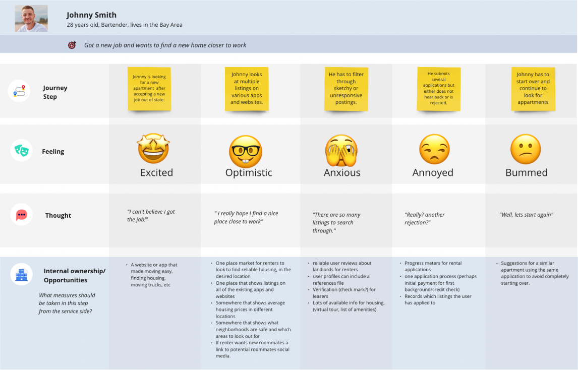
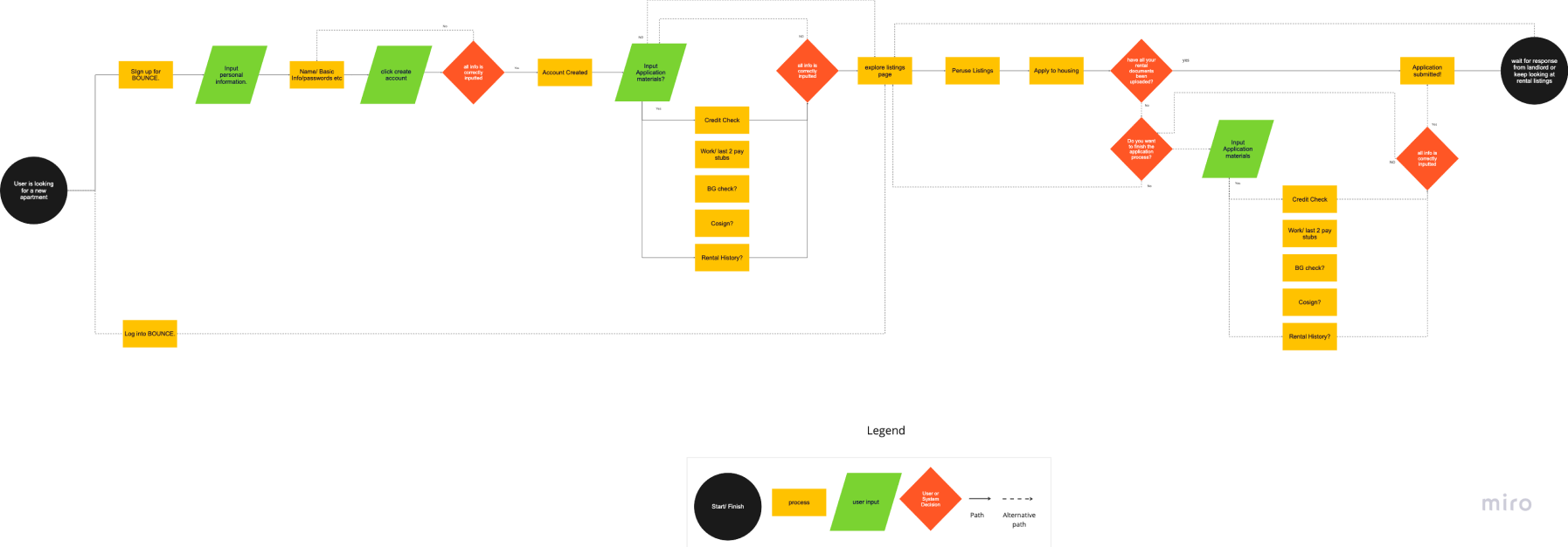
Our user flow helped us to map out the basic structure of Bounce's onboarding and rental application process.
Wireframe and Prototype
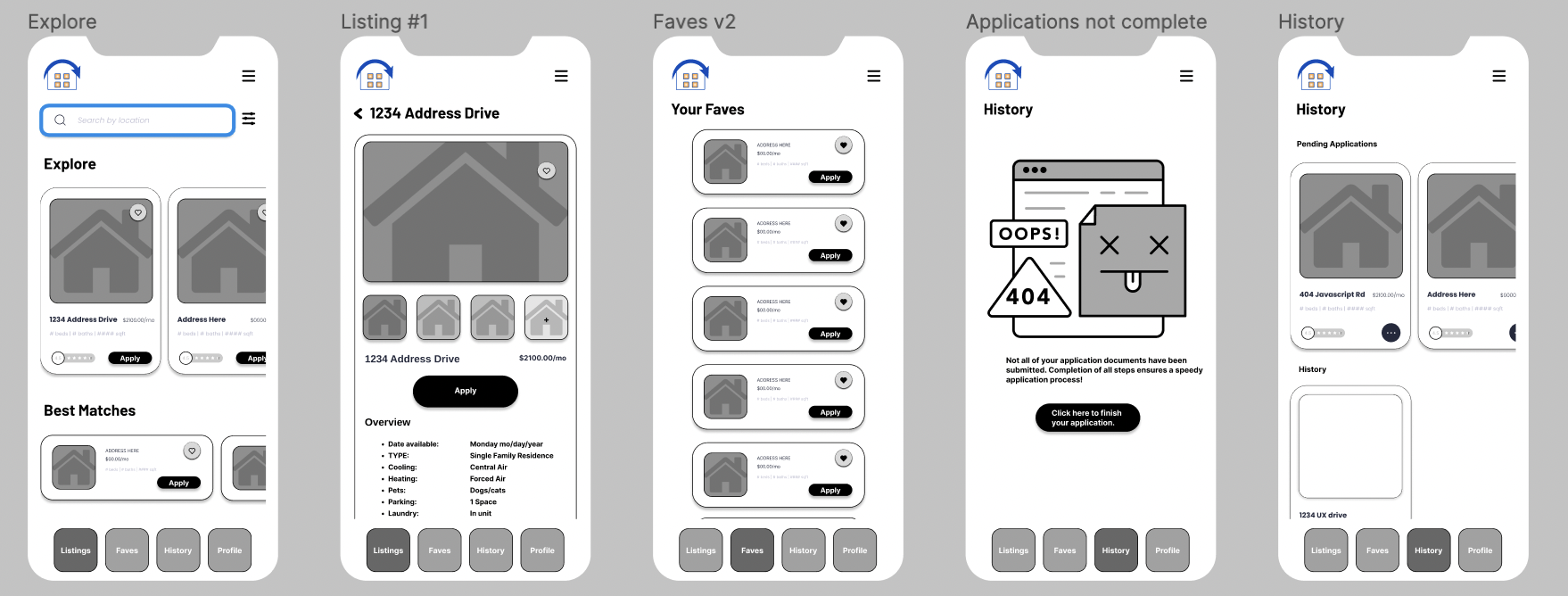
From the user flow, we were able to create a low fidelity prototype for Bounce's interface structure. the features we implemented were the universal application, rental listings, and a featured listing for more nuanced selections.
From the user flow, we were able to create a low fidelity prototype for Bounce's interface structure. the features we implemented were the universal application, rental listings, and a featured listing for more nuanced selections.
Prototype Testing
After the research team performed a usability tests for our first prototype, we discovered that this iteration of the onboarding process still presented too much information at once which proved overwhelming to users. Additionally, users wanted more information about the application and it's security, and that the location for search filters was difficult to find.
After the research team performed a usability tests for our first prototype, we discovered that this iteration of the onboarding process still presented too much information at once which proved overwhelming to users. Additionally, users wanted more information about the application and it's security, and that the location for search filters was difficult to find.
Post Testing Iteration
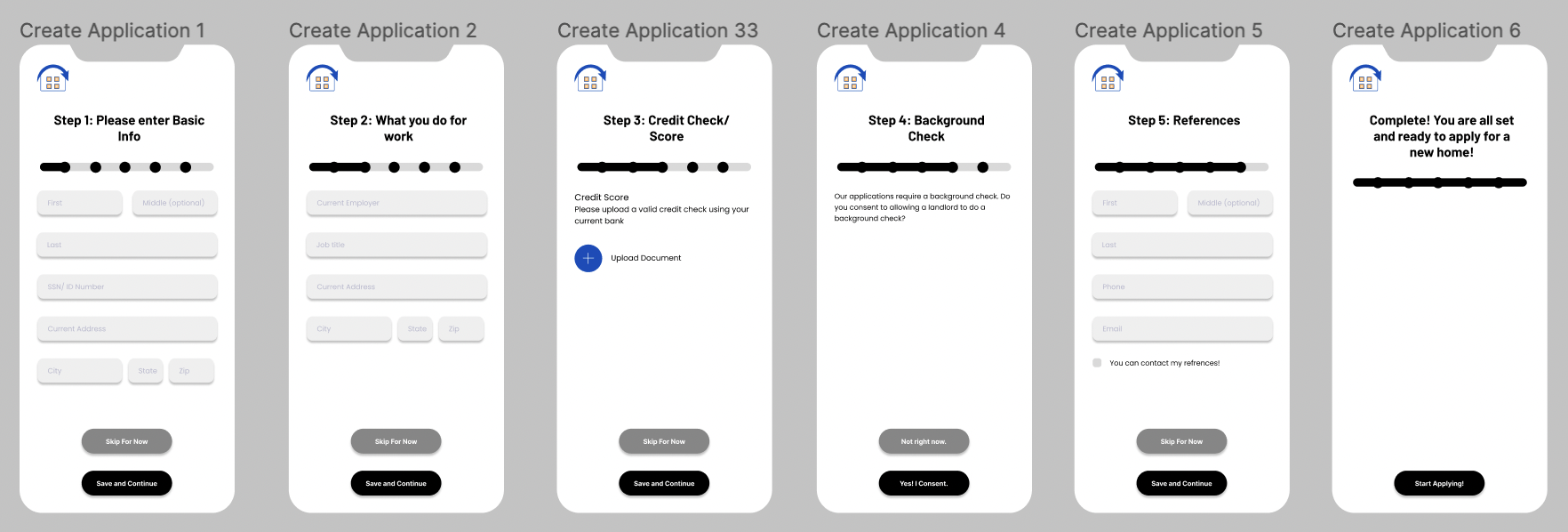
In response to our user feedback, we spaced out the onboarding process by separating the rental application process into separate pages for each field (info, salary, background check, etc). We also added a short 3 page informational flow that explains the app, our features, and it's safety before the signup process.
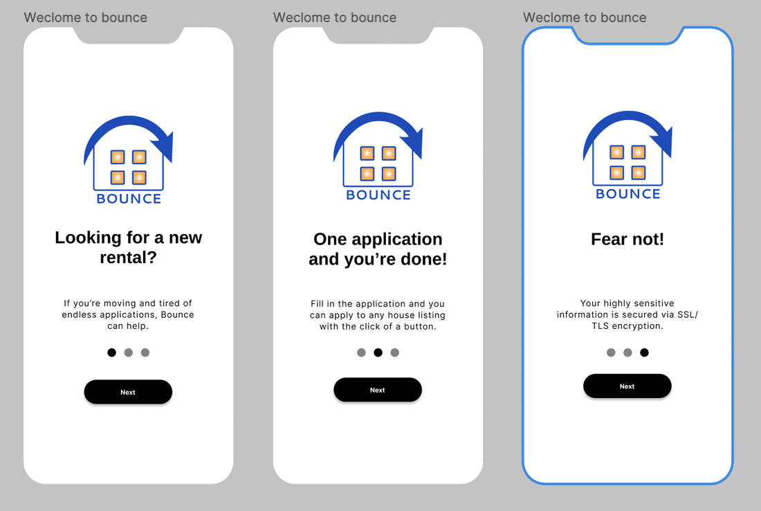
In response to our user feedback, we spaced out the onboarding process by separating the rental application process into separate pages for each field (info, salary, background check, etc). We also added a short 3 page informational flow that explains the app, our features, and it's safety before the signup process.
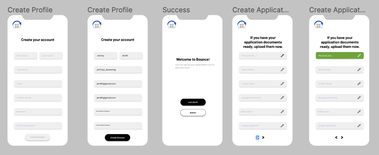
Pushing the Prototype to High-Fidelity
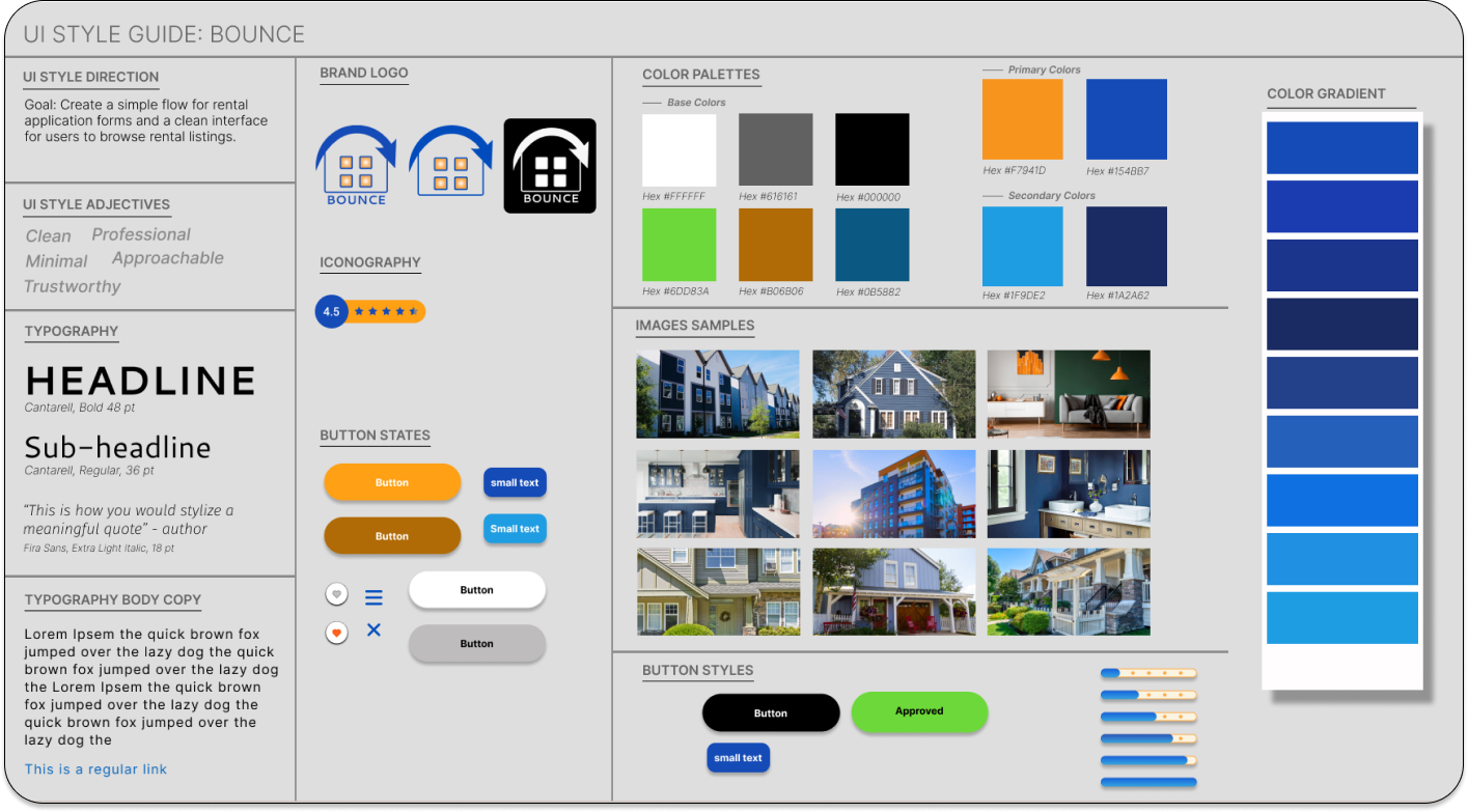
As we pushed our prototype to high-fidelity, we created a style tile to keep our design aesthetic consistent. We used a predominantly blue color to help foster a calming effect during a potentially stressful moving time with pops of orange as accents.
As we pushed our prototype to high-fidelity, we created a style tile to keep our design aesthetic consistent. We used a predominantly blue color to help foster a calming effect during a potentially stressful moving time with pops of orange as accents.
Clickable Prototype
Thank you for reading! I hope you have a lovely day. ~William